
elementary OS Freya Beta 1 is Looking Sparse But Fast and Sleek
By Andrew Powell, published 25/09/2014 in Previews
elementary OS is a GNU/Linux distribution that you will either adore or on the other hand, find isn't for you. Fast, tight and favouring beauty and a logical simplicity over the ability to customize every little thing, eOS takes a different approach to many Linux distributions. In this article we shall take a look at elementary OS Freya Beta 1, a preview of the upcoming Freya release.
First of all, it's worth mentioning:
This is a beta release, of which in my overview/preview is being run in a live USB session on real hardware. The elementary OS developers caution against installing this build on production machines as it may well kill your cat or set your house and indeed, you, on fire. Well, maybe not, but you get my point! All that is seen below may also not be indicative of the final release quality.
With that out of the way, let's have a look at this increasingly popular distribution and how the new Freya release is coming along.
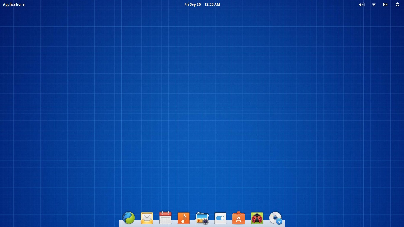
The boot-up from the live USB from the elementary OS splash screen to the desktop was nice and quick. Basically as smooth and quick as you could hope booting from live flash media, but for eOS, a speedy boot time is one of it's well known features.
The desktop you come to see, which is elementary OS' own desktop environment called Panthorn, of course, has a somewhat familiar looking wallpaper if you have ever seen a beta release of elementary OS before. Indeed, the folks developing eOS like to smack a suitable wallpaper in the pre-release versions, so as to make it obvious that what you are trying out and/or using is a work in progress. Thankfully, a quick look at System Settings -> Desktop will net us a nice selection of pretty wallpapers.
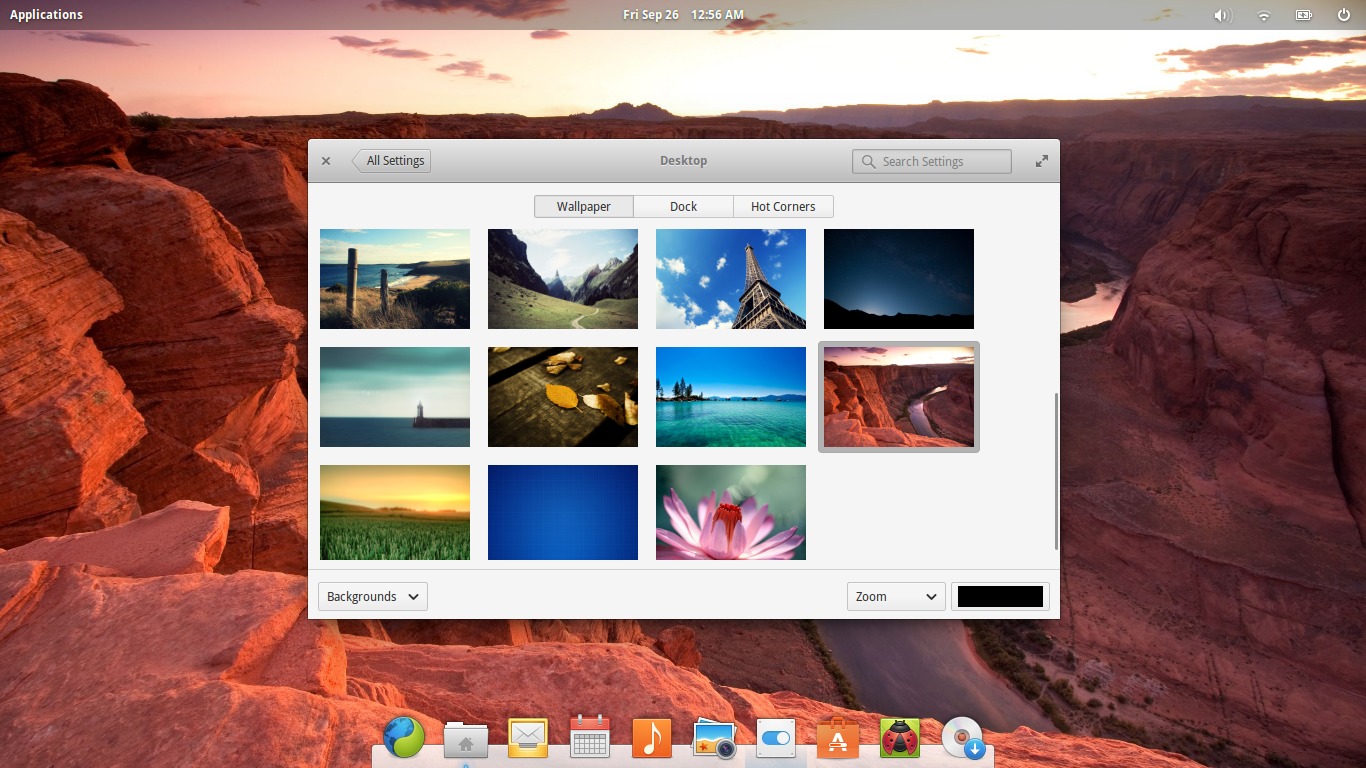
Much better.
One of the cool new features of elementary OS Freya is the automatic "smart" transparency handling of the top panel. Basically, when you change wallpaper, it adjusts it's opacity level depending on whether, for example, the panel would look "better" with semi-transparency on your chosen wallpaper or better with a completely transparent background. See the image below for an example.

Comparison of the top panel with two different wallpapers. Notice how in one shot the panel is completely transparent but not so in the other, likely because the example in the top shot would make the text/icons in the panel hard to see. Clever.
The panel has a fairly standard set of essentials, in a similar manner to Unity or GNOME Shell. You have an applications menu, a clock in the middle and the "indicators" and system/power button on the far right.
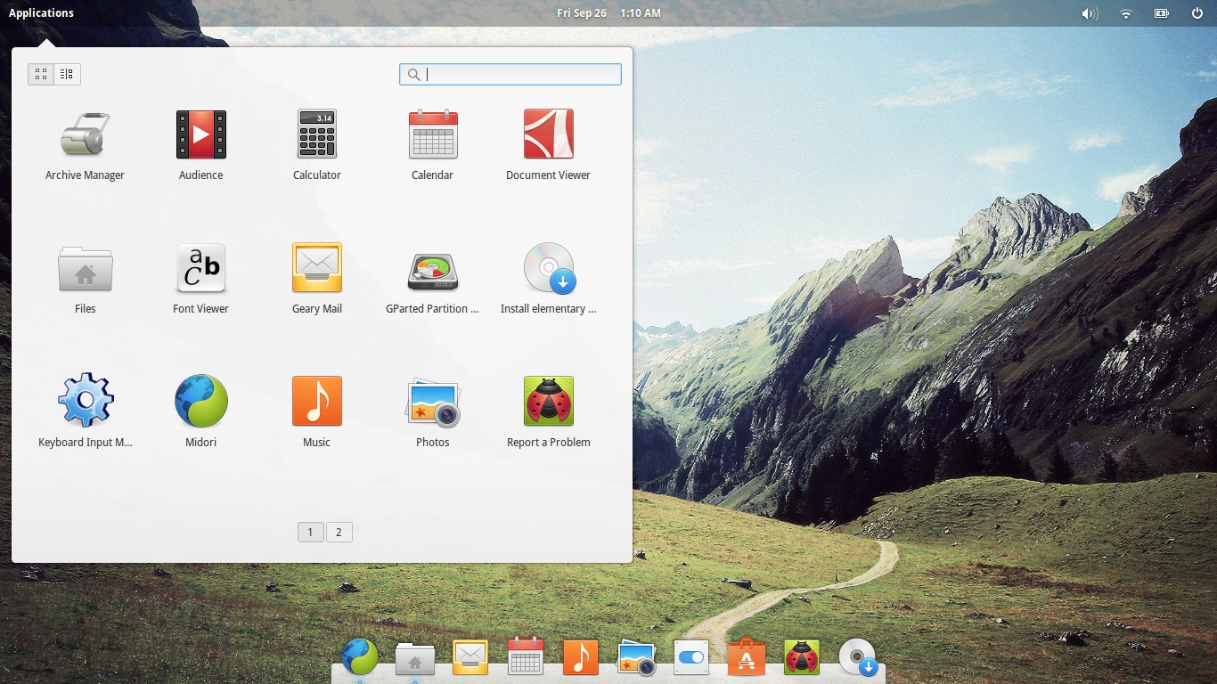
The applications menu is a nice smooth implementation (pro tip: Super + Space key combination opens up the apps menu if you prefer keyboard control) and has a nice touch where you can switch between the large icon browsing mode or the more traditional "by category" mode for those who prefer that style of menu.
Apps
Besides it's own custom desktop environment, eOS sports it's own applications, for the most part. A couple of apps such as the web browser (Midori) aren't exactly elementary specific, but they fit the desktop nonetheless. Otherwise, eOS has it's own apps built and styled to fit in with the Pantheon desktop. Let's have a quick run down of the main apps:
Files
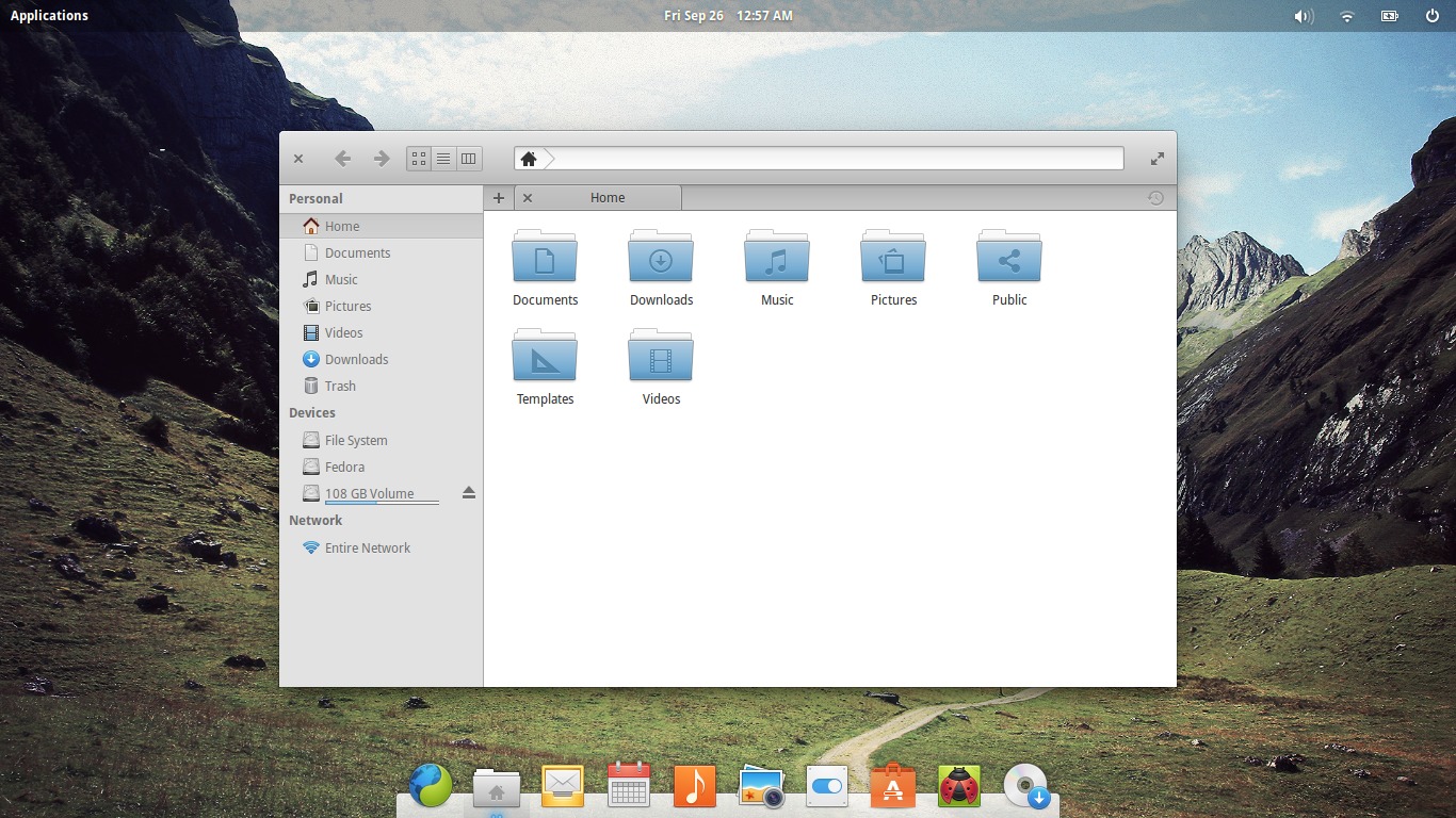
Simple, basic file manager with a look and feel akin to the likes of Nautilus, Nemo etc. Features bookmarks, mounting/unmounting of devices and network browsing and three different view modes so all the usual functionalities of a modern file manager is covered. However, it lacks any customization options (although, again, this is elementary OS) so if that's your go you may be a bit disappointed. It does it's job however and is clean and fast.
Music
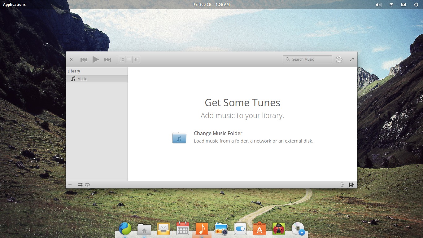
Also known as "Noise", Music is a lightweight music player/dukebox that has Last.fm support and minimal configuration options, in keeping with the style of elementary applications. Doesn't appear to have per artist or album search but rather relies on the search functionality.
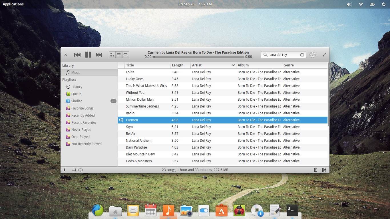
Besides having to install the appropriate codecs beforehand (the application notifies you of what is needed and assists you in installing), it does indeed play music. If you love minimalistic pure music players with a nice GUI, you'll probably love this one. Otherwise, you may well be going to the Software Center (more on that in a moment) to download something like Rhythmbox.
Photos
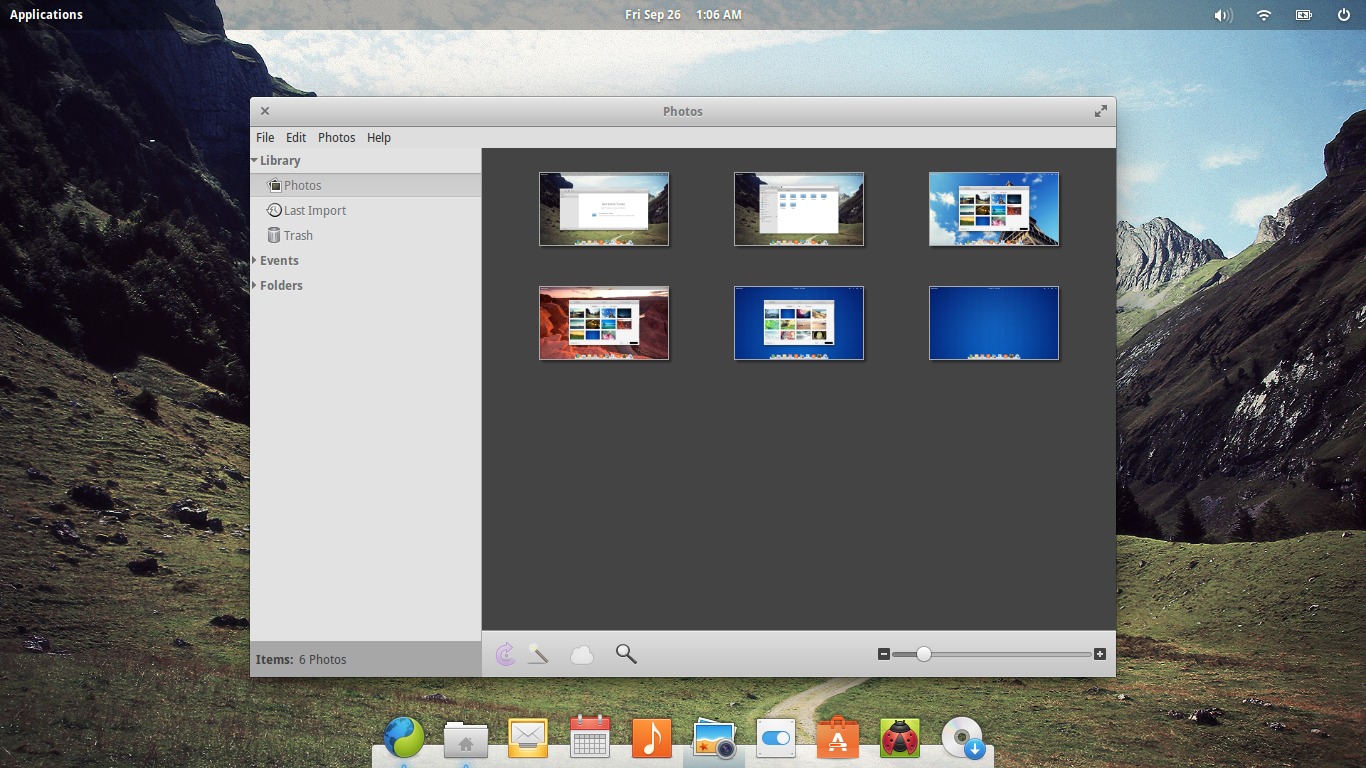
Photos is in actual fact an elementary fork of Shotwell and as such looks and functions in a similar manner, with some changes to it's dialogs such as the Preferences dialog and likely stripped of some (deemed unnecessary) features.
Software Center
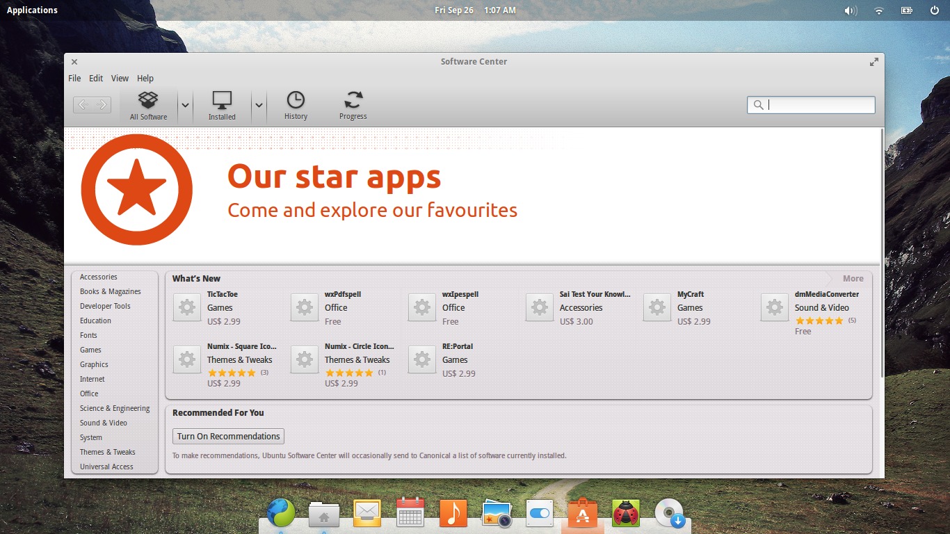
Well, being that eOS is indeed based on Ubuntu, naturally this is actually the Ubuntu Software Center. There isn't much to say about this application, since most people would be well and truly familiar with it.
Geary Mail
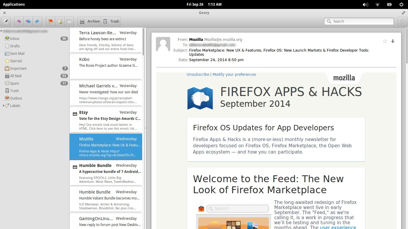
Lightweight IMAP mail client with a nice clean interface with three panels - sidebar for accounts/folders, middle panel for actual displaying list of emails and a third for displaying the emails themselves. Fast and light with minimal configuration options, Geary is another application that isn't specific to eOS but fits very nicely within the distribution. I actually do use this application sometimes in Arch Linux or Fedora (depending on which of my computers I am running), as it's very nice option for quickly setting up and accessing, for example, Gmail which it handles beautifully.
Midori Web Browser
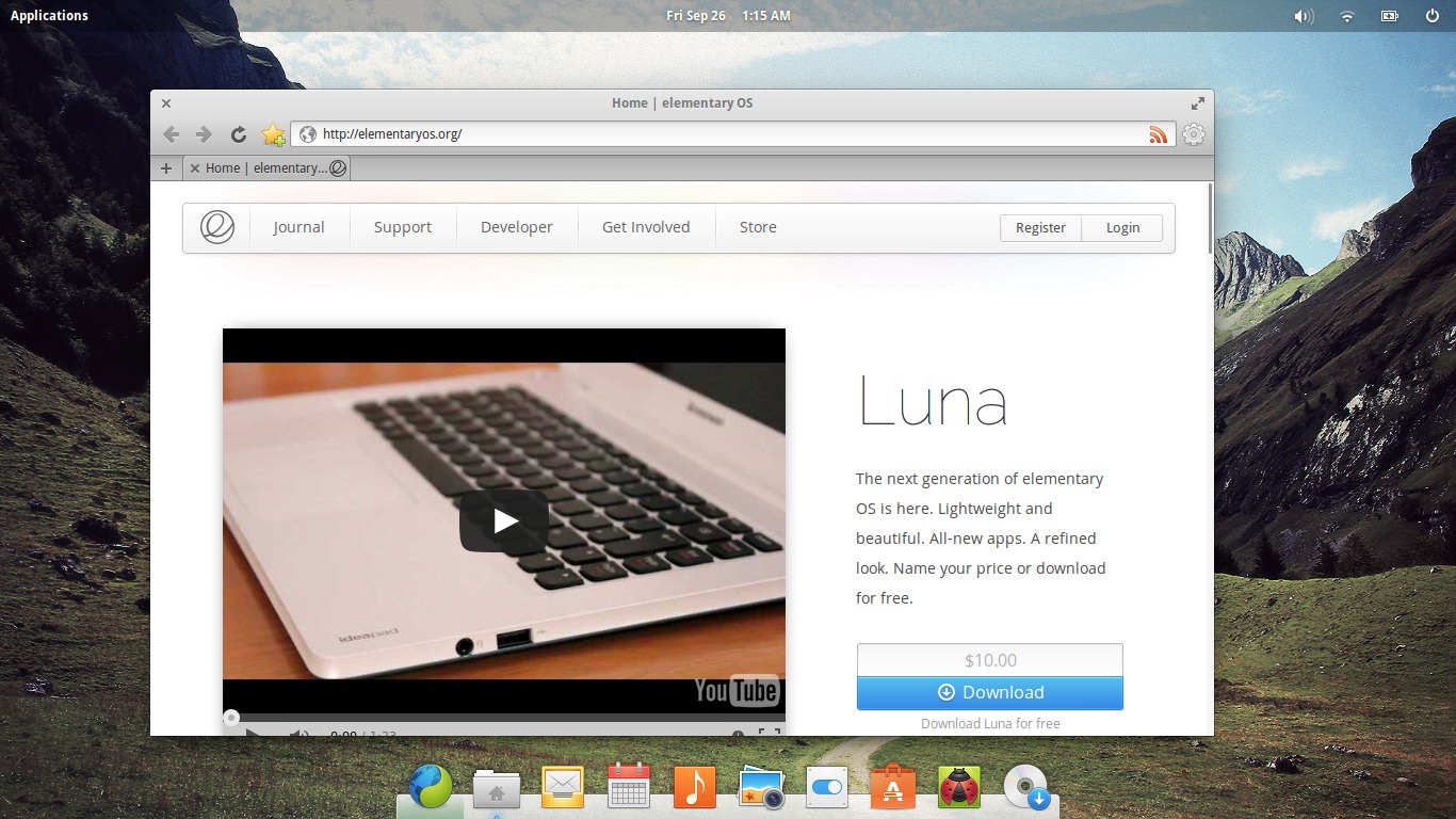
Again not an elementary OS specific application, Midori is a lightweight and extensible web browser based on the WebKit engine. Display of all web pages is not perfect, so one might argue it's still not quite up to par with it's heavier web browser cousins such as Chrome/ium or Firefox, but it most often gets the job done. Kudos for DuckDuckGo being the default search engine.
Scratch Text Editor
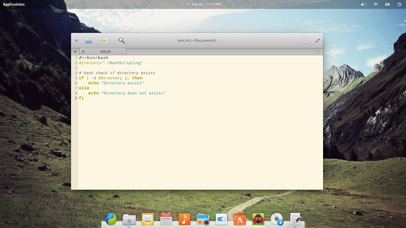
Scratch is a simple lightweight text editor, featuring "Solarized" colour schemes out of the box as well as support for extensions akin to Gedit. The aforementioned Solarized colour schemes being included and activated out of the box is a particularly nice touch in my opinion.
Audience Video Player
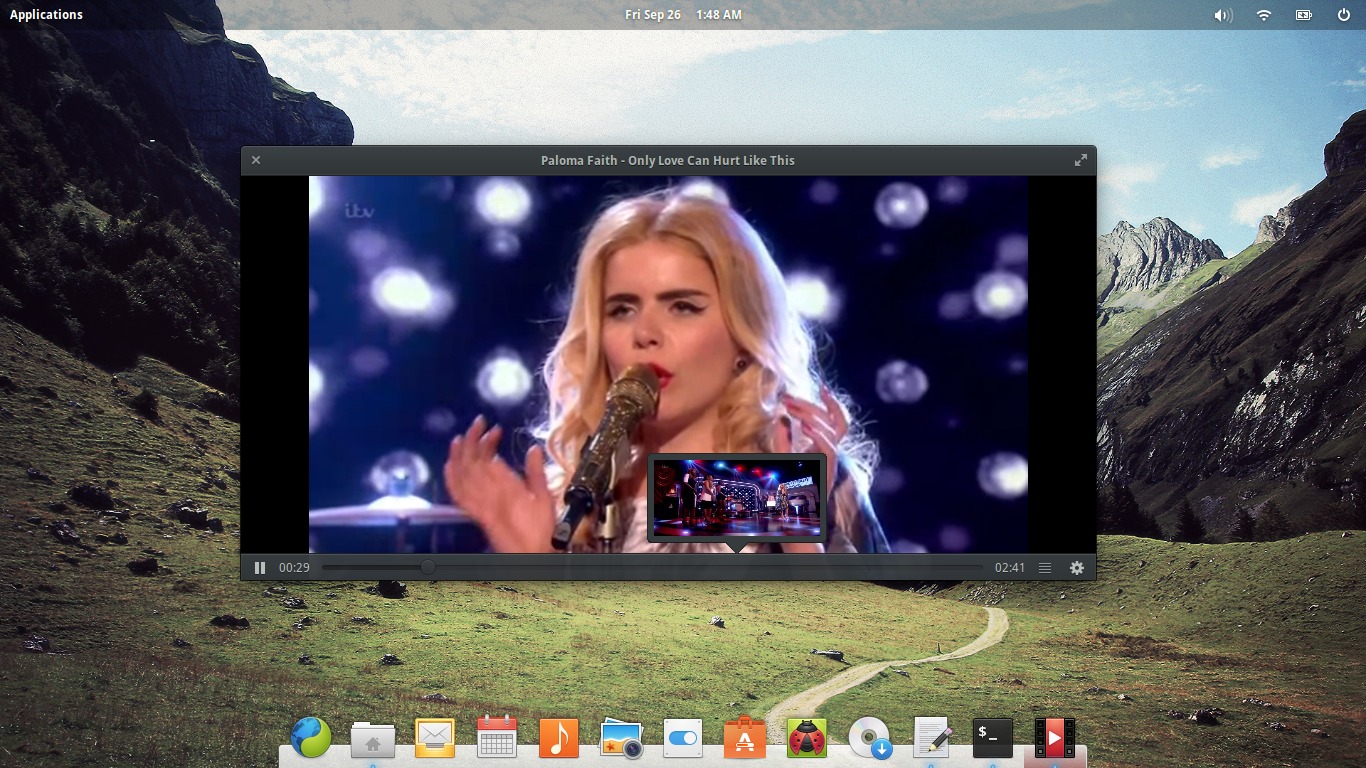
Audience is a very basic video player with support for subtitles, has the usual playback controls as well as a thumbnail tracker preview similar to what you see on YouTube, etc. That's pretty much literally all that Audience has - at the end of the day, it plays videos and doesn't strive to provide any extra options beyond the absolute essentials. So while many of you will probably keep VLC close by your side, as a core application (and naturally a pretty one at that) I can see Audience doing it's job.
Sparse but sleek and fast as ever
So, is Freya looking to be a stellar upcoming distro release, even at this (beta) stage?
My first impressions say yes. Obviously a live session is no great indicator but stability seemed fine and the operating system behaved as it should, all the while being lightning fast and one heck of a smooth looker.
It is sparse. By this I mean beyond what you see on the Pantheon-powered desktop and the applications I listed above, there isn't much else. This is of course by design. elementary OS is meant to be a tight, lightweight but very attractive and user-friendly experience and it certainly looks set to be succeeding here.
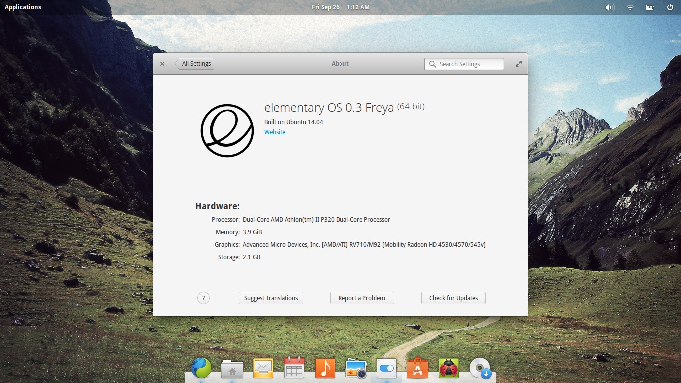
If you've used elementary OS "Luna", the current stable release of eOS, there isn't really much that seems all that different in Freya, except for some obvious differences. The most obvious difference will be the base under the hood - Luna was based on Ubuntu 12.04 LTS, while Freya is based on Ubuntu 14.04 LTS. Of course, some visual tweaks such as the panel transparency handling mentioned earlier in this article, while subtle, are nice little additions so far.
I would say Freya is looking to be, for the end user, mostly an incremental update over Luna, featuring an updated Ubuntu base (significant enough in itself, to be honest) and further improvements and tweaks to the Pantheon environment.
Which is no bad thing.